by David Tristan Yumol
Call it a facelift, but not a complete overhaul of the identity of being matatapang at matatalino.
The University of the Philippines (UP) Fighting Maroons varsity teams will now use a new logo for the Season 78 of the University Athletic Association of the Philippines (UAAP), which was launched during the annual Pep Rally at the University Theater of the UP Diliman campus, Friday.
This move coincided with UP’s role as the host school for this season of the eight member-school collegiate league.
Among those who graced the affair were UP President Alfredo Pascual, Chancellor Michael Tan, College of Human Kinetics [dean] Ronnie Dizer, and the students.
Veteran commercial director Mandy Reyes, head of the design team for the new logo, explained that the suggestion of this change first came from the UP administration.
The use of the Oblation as the main visual representation of UP for the longest time was already abandoned since the administration “does not want it to be merchandised”.
“Intellectual property ng UP iyon eh. Ayaw nila na ibebenta lang kung saan-saan iyong logo (UP owns the intellectual property of the Oblation. They don’t want to sell it anywhere),” said Reyes, who met with Tan during the consultations for the creation of the new logo.
However, the Oblation can still be seen at the practice uniforms of the players, medals, and trophies.
Reyes, a UP Broadcast Communication graduate, added that the Oblation is an unofficial logo of the school. The need to create a new logo was also based on the fact that the team name, Maroons, was a very “vague” one.
“Hindi concrete katulad ng Bulldogs, Tamaraws, at Tigers. Hindi natin alam kung ano ba talaga iyong Maroons. Baka nakuha lang siya kasi Maroon ang ginagamit nating color palagi (The team name is not concrete, unlike the Bulldogs, Tamaraws, and Tigers. We don’t know what Maroons really mean. Maybe, it was used because it is the color that we always use),” said Reyes referring to the monikers of National University, Far Eastern University, and University of Santo Tomas, respectively.
Reyes also said the Maroons are actually a group of black slaves based on his research.
“Imposible naman na ito iyong inspiration ng Maroons, di ba? Bakit foreign? Bakit slaves? It’s not so UP (It’s impossible that this is the inspiration to have Maroons as the team name, right? Why is it foreign sounding? Why slaves? It’s not so UP),” Reyes said.
The first logo released by the UP CHK received unfavorable responses among the UP community which prompted the UP administration to seek help to nowhere to go but UP, a non-profit group that supports the different athletic teams of the state university, for the new design.
As a member of that group, Reyes asked the help of fellow alumni who are active in the design industry.
UP Fine Arts alumnus Dan Matutina of Plus63 Design Company led the pool of designers who volunteered to create the new logo pro bono.
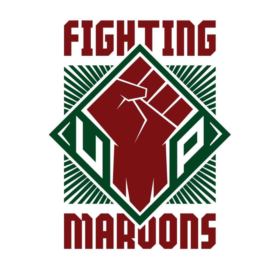
Matutina shared there was a unanimous choice among his fellow designers in choosing the left fist as the center of the new logo.
“Some people actually didn’t like the idea of using the left fist because they are not a tibak (activist), but using the right fist would be wrong,” Matutina said. “UP has never been about the status quo, we’re non-conformist.”
According to Matutina a raised fist is also a rallying call- a call for everyone “to congregate and support the Fighting Maroons.”
Matutina also explained the symbolisms on each part of the new logo.
“On the wrist area is the “M” so that even if we only use the fist as a “partial” logo it still says Fighting Maroons,” he added.
The green lines outside the fist, meanwhile, were placed to show that it was bursting out of the box.
With the new logo getting more praises from the UP community than the previous, both Reyes and Matutina are optimistic that it will boost the morale of the student athletes.
“Our new logo exemplifies the true identity of UP. Radicalism is in our DNA,” Reyes said. “But it’s not all about it. The more important factor is to support our athletes.”
“Because of the new identity, our alumni are pitching in to help the athletic teams,” Matutina said.
Clarence Kasilag, a Computer Science freshman who attended the Pep Rally, gave a positive review of the new logo.
“Iyong fist talaga ang tatak ng UP. So, talagang maganda na nilagay iyon doon (The fist is really the mark of UP. So, it is proper that it should be put in the logo),” he said.
The 78th season of the UAAP will open on September 5, Saturday, at the Smart Araneta Coliseum. The men’s basketball team will face last year’s host University of the East for the opening game at 2 p.m.